Dominion Property – Building a Bold Identity
Logo Design · Brand Direction · Identity Book
Overview
Dominion Property Holdings Inc. is a real estate investment firm aiming to stand out in a highly competitive market. With ambitions rooted in authority, trust, and long-term value, Dominion needed a brand that would feel premium, powerful, and built for legacy.
My task was to craft a distinct visual identity that would resonate with investors and stakeholders, while reflecting the brand's confident, growth-focused vision.
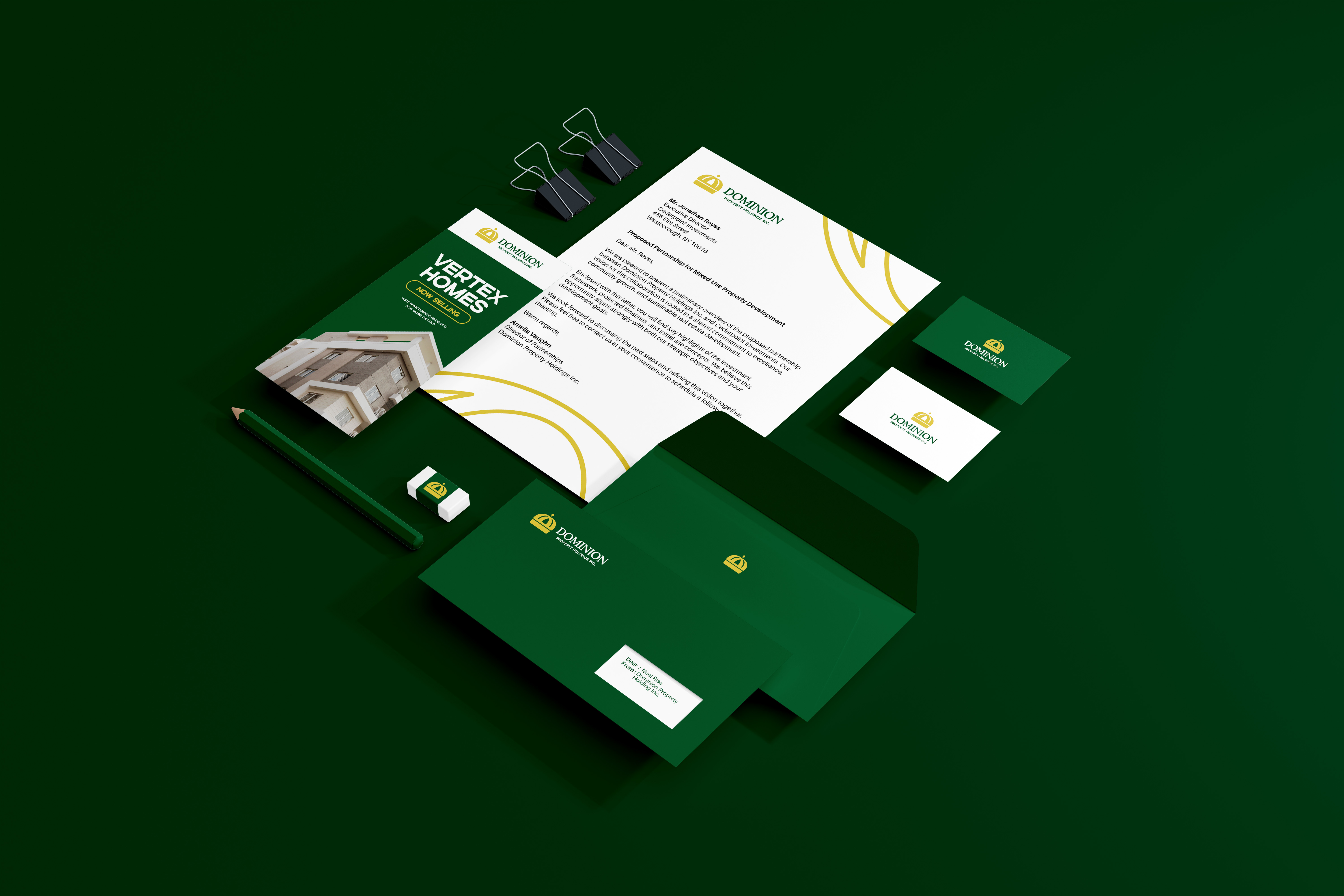
The Challenge
Dominion Property wanted to move beyond the standard real estate look — no overly corporate clichés, no generic rooflines or serif-heavy logotypes. The challenge was to create a refined and commanding identity that would communicate credibility, control, and ambition — all without compromising modern appeal. The brand needed to visually express its name — Dominion — in a way that would leave a lasting impression.
My Approach
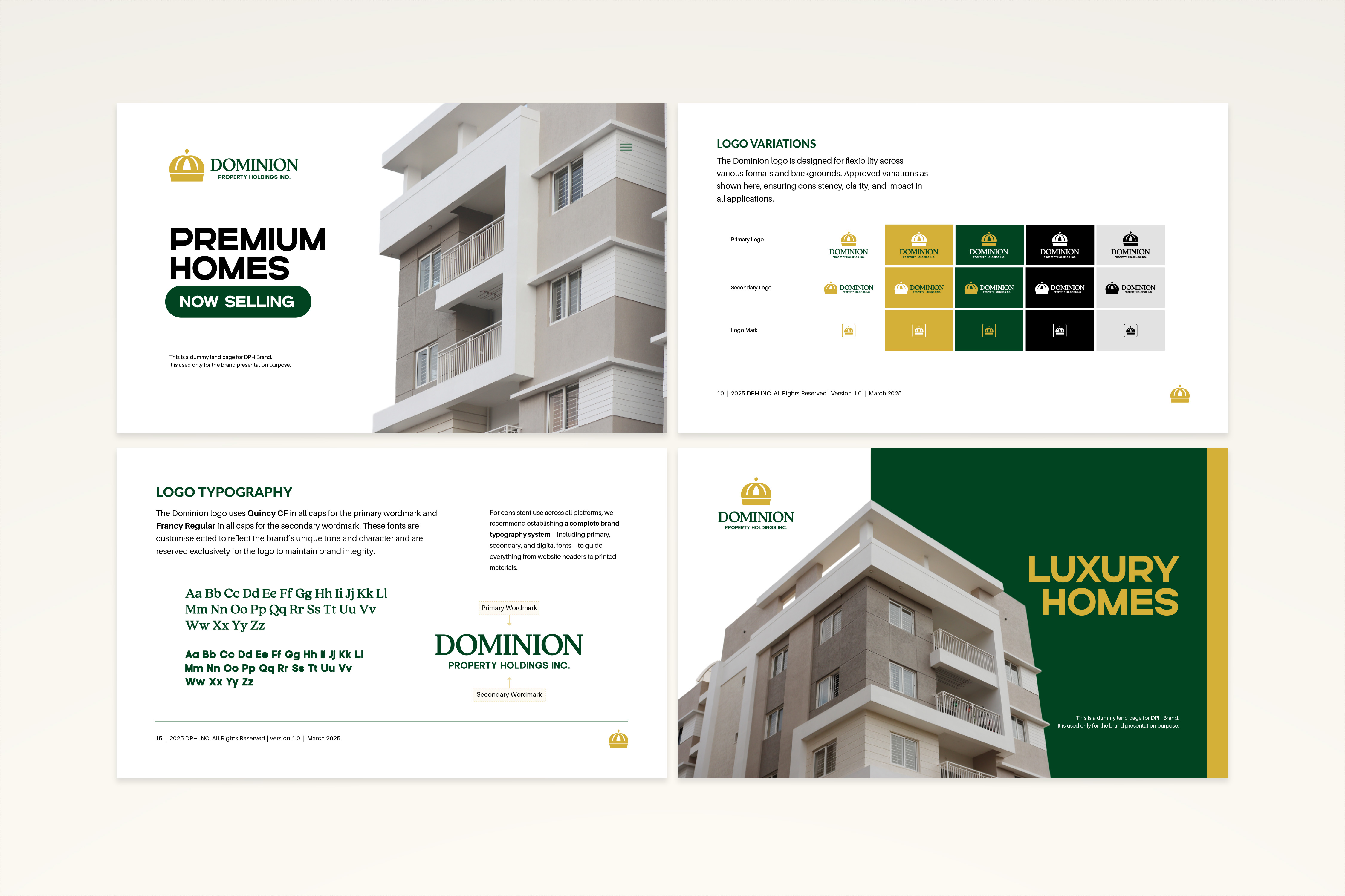
I designed a bold and balanced logomark that symbolizes strength and structure, paired with a clean, high-contrast wordmark to anchor the identity. Every visual decision — from typography to spacing — was made to evoke trust, control, and professionalism. A supporting brand direction document was created to guide logo usage, color palette, tone of voice, and applications across print and digital. I also provided art direction suggestions to ensure consistent rollout across collateral and investor materials.
Deliverables
* Custom Logo Design & Symbol
* Logo Book with Construction & Usage Rules
* Visual Identity Guide (Typography, Colors, Layout Principles)
* Brand Strategy & Direction Framework
Impact
The Dominion identity now projects a sense of clarity and command, helping position the company as a trusted, long-term partner in the real estate investment space. With a bold yet minimal visual language, the brand stands ready to attract stakeholders, scale across new markets, and build a name synonymous with real estate excellence.