
FarmFix – Fixing the Future of Agriculture
Logo Design · Brand System · Identity Guide
Overview
FarmFix is an emerging agritech company on a mission to fix farming by uniting key players across the agricultural value chain. From farmers to investors, the platform empowers stakeholders to deliver sustainable food solutions and impactful returns. Our goal was to design a brand identity that communicates this mission with clarity, character, and confidence.
The Challenge
FarmFix needed more than just another green-agriculture logo. They wanted a brand that stood out in a saturated space, balanced professional credibility with emotional relatability, and symbolized collaboration and growth.

Our Approach
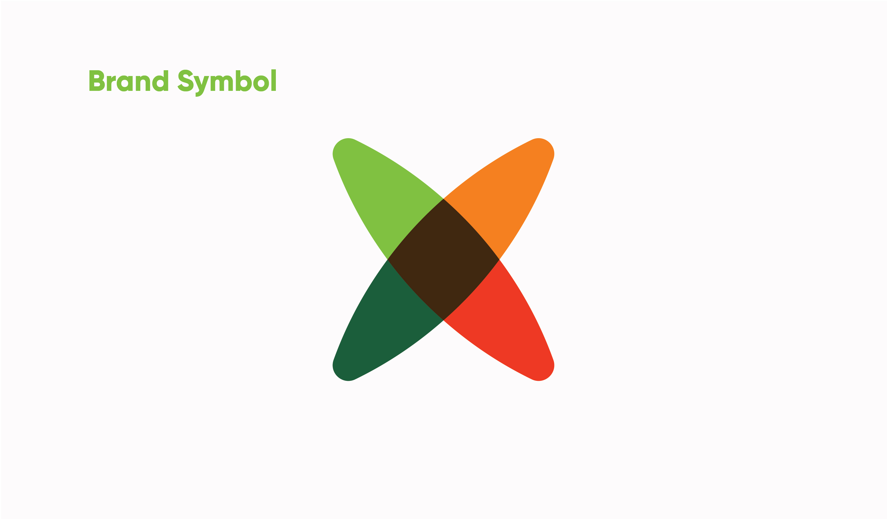
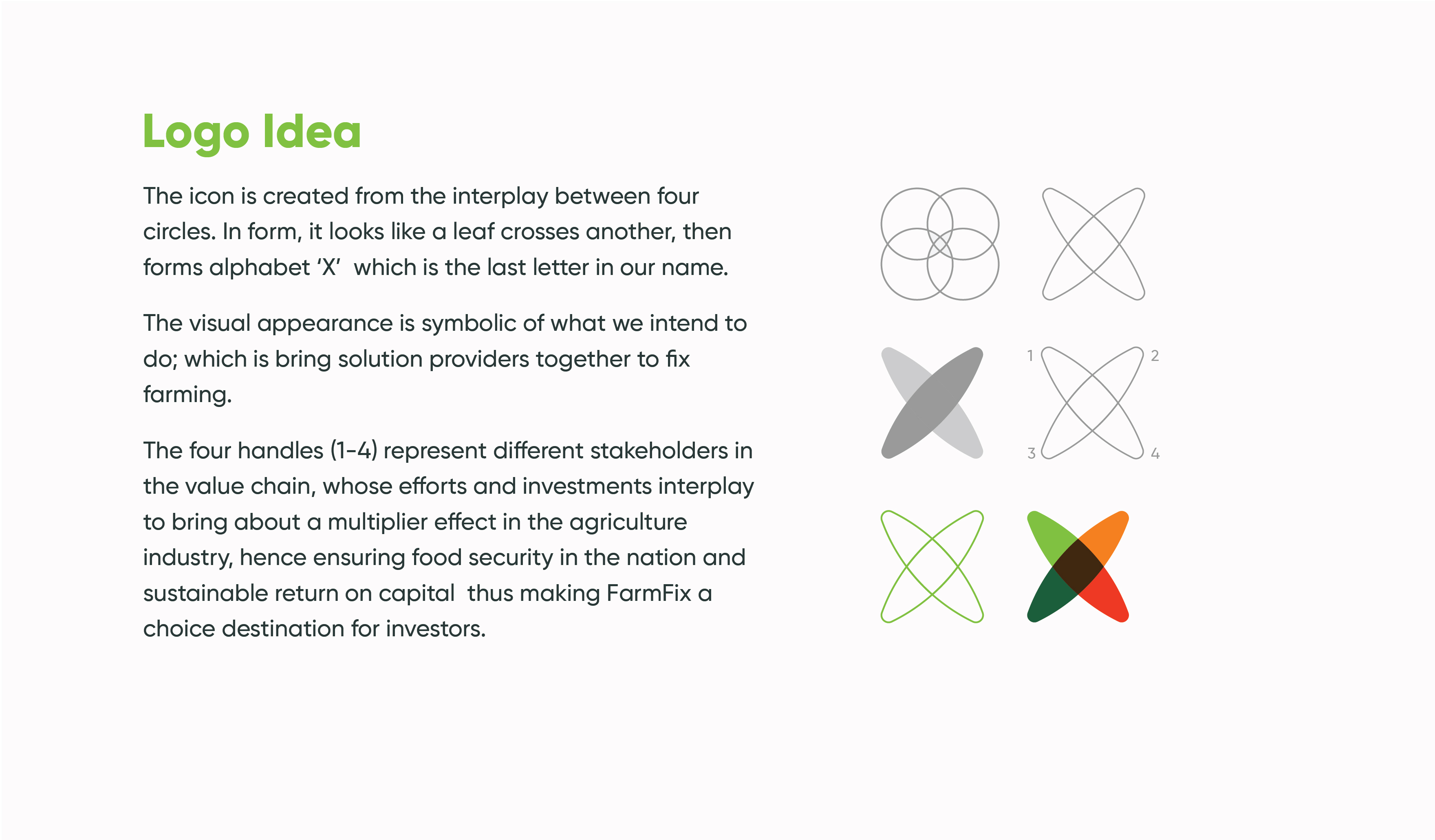
We created a visual identity rooted in meaning: A dynamic “X” symbol, formed by intersecting leaf shapes, representing unity across the value chain. A bold, earthy color palette inspired by farm produce, soil, and vegetation, chosen to elicit trust, vitality, and optimism. A brand system that feels versatile, modern, and unmistakably agricultural. The typography (Myriad Variable Concept) and custom spacing system reinforce the brand’s approachable, grounded character.
Deliverables
* Logo Design (Symbol + Wordmark)
* Color Palette & Typography System
* Logo Construction Concept & Meaning
* Brand Guidelines (Spacing, Usage, Applications)
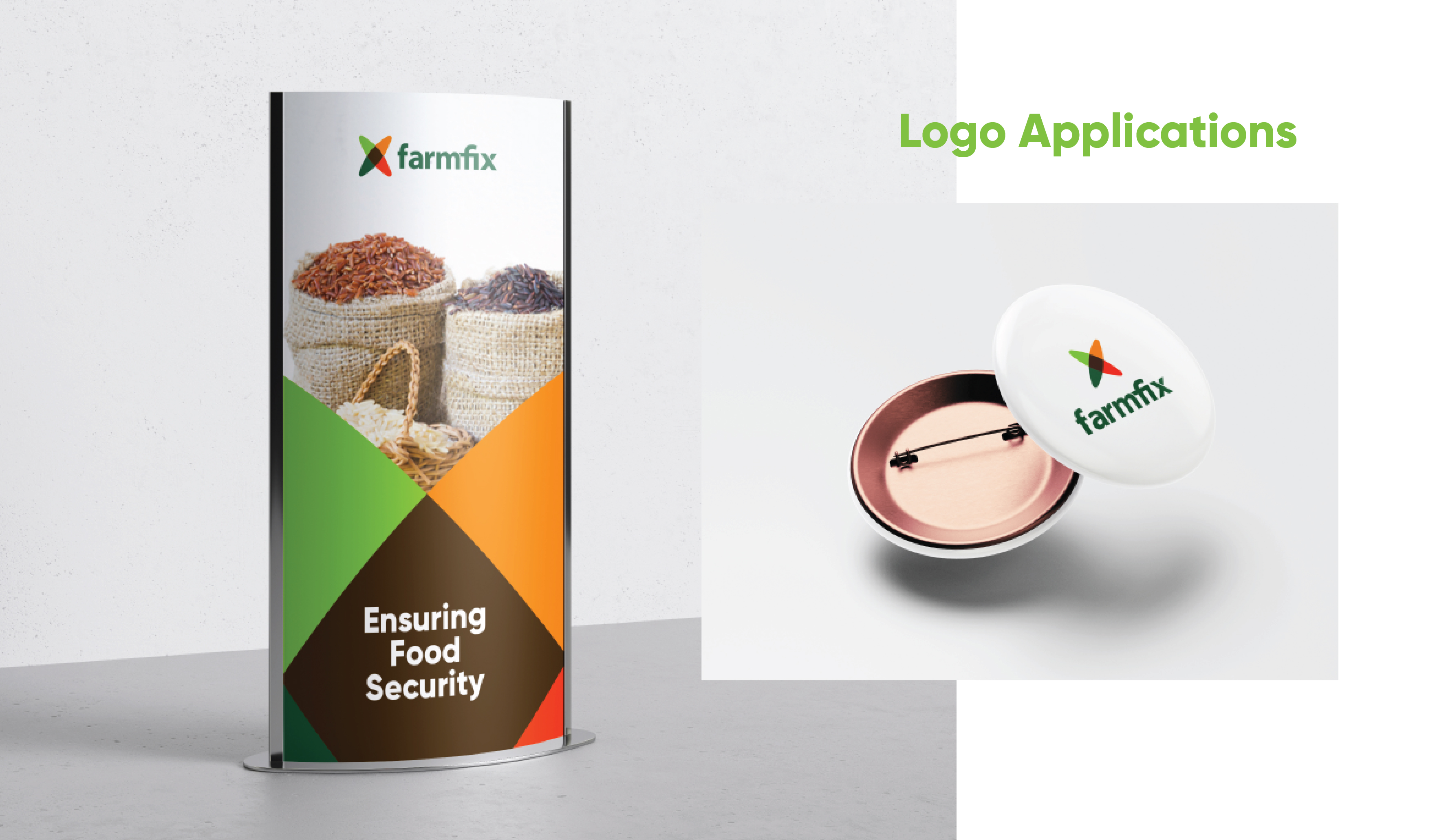
* Digital Asset Mockups (Signage, Pins, Posters)
Impact
The FarmFix identity stands out across platforms and competitors — instantly recognizable, emotionally resonant, and ready for scale. With a strong visual system in place, the brand is now equipped to inspire trust in investors and belonging in farmers, building a visual narrative around the idea of fixing farming—together.
